Project Description
Solar Sync
Brand logo design and style guide
The contents of this document are a product of my imagination and serve as a personal project. Any resemblance to existing works is purely coincidental.
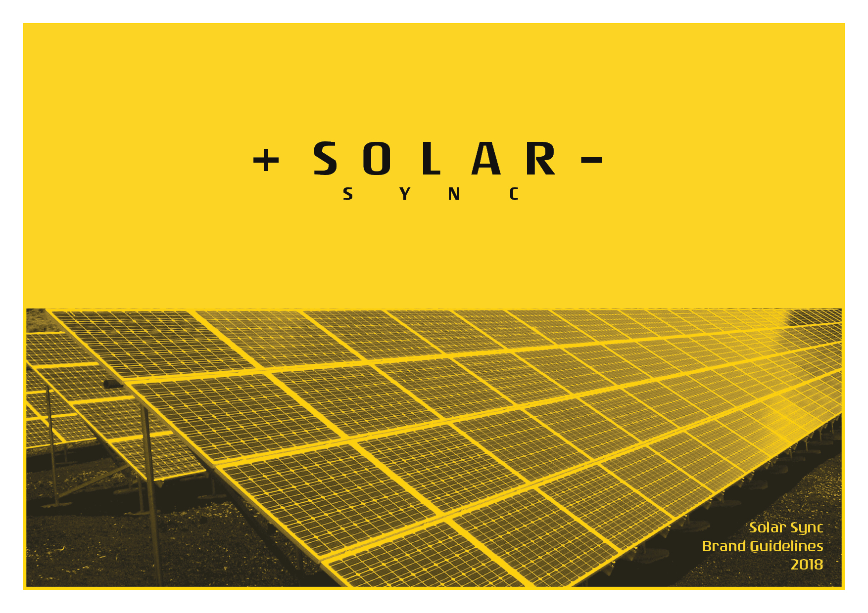
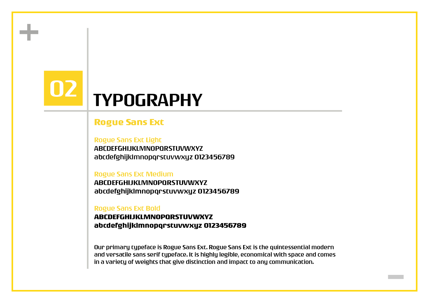
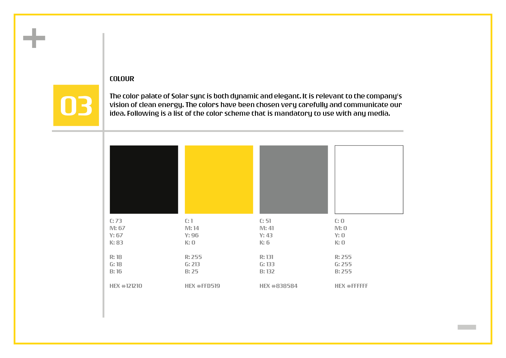
Solar Sync is a brand identity that I have developed as part of a personal project. My objective was to create a visual identity for an organization and establish guidelines for their company/brand logo. I specifically chose to focus on a sustainable energy company for this endeavor. In order to accomplish this, I conducted thorough research on visual elements, graphics, and appropriate terminology associated with the company. Additionally, I engaged in brainstorming activities to cultivate initial ideas. After generating a diverse range of concepts, I carefully selected those that resonated most with me.
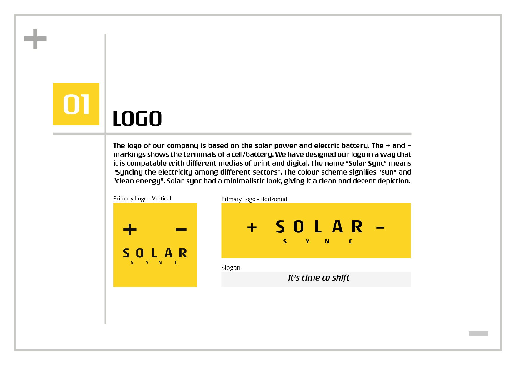
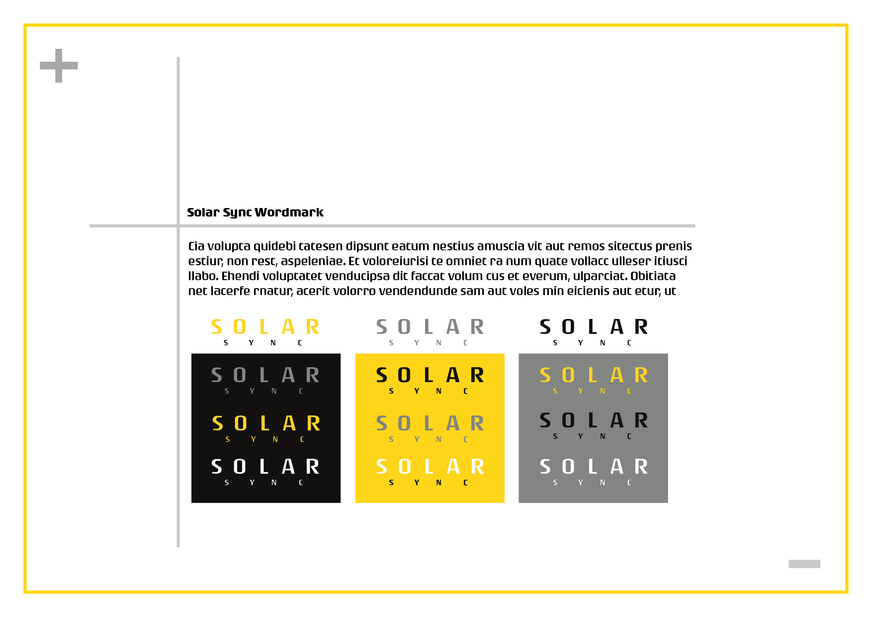
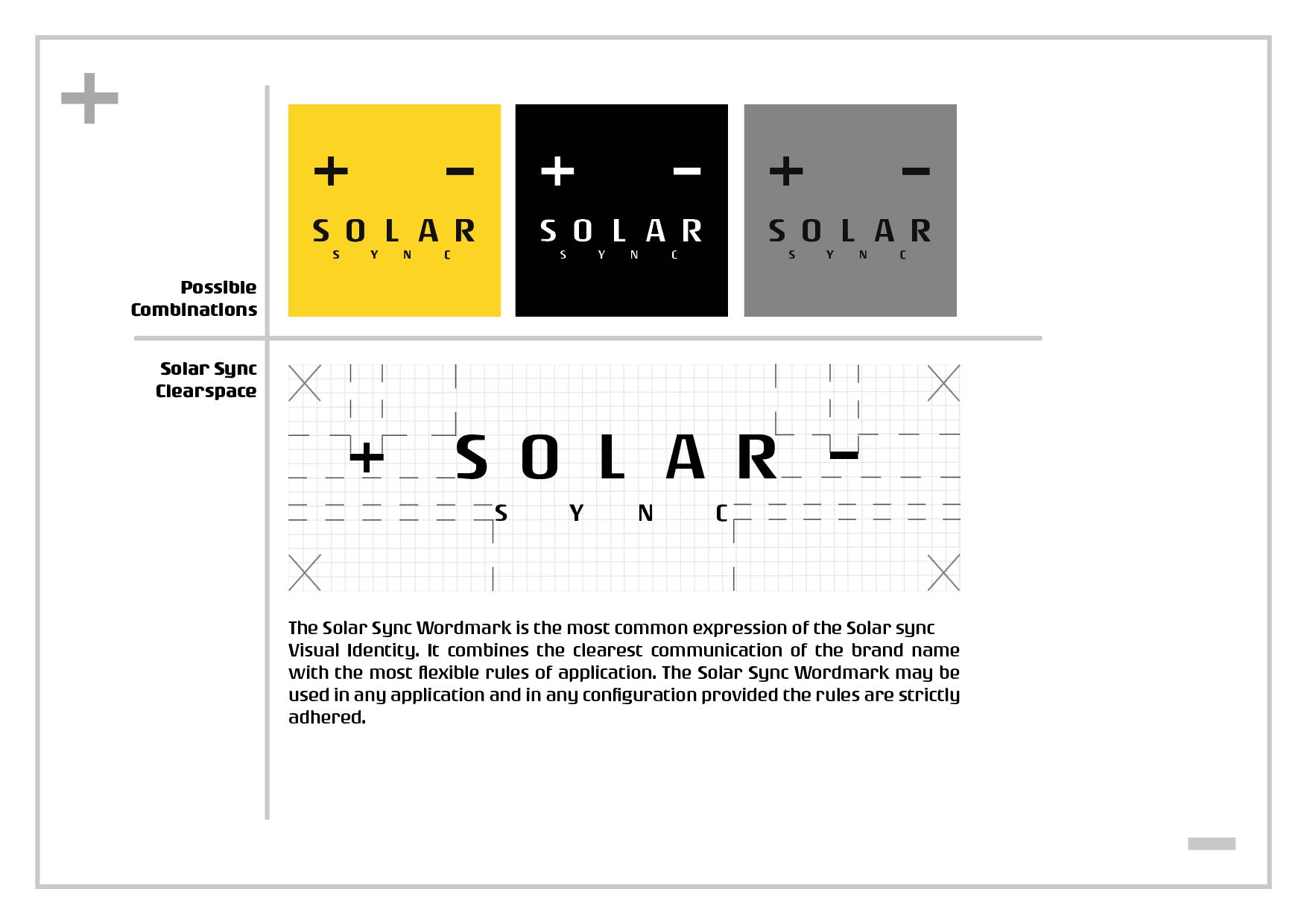
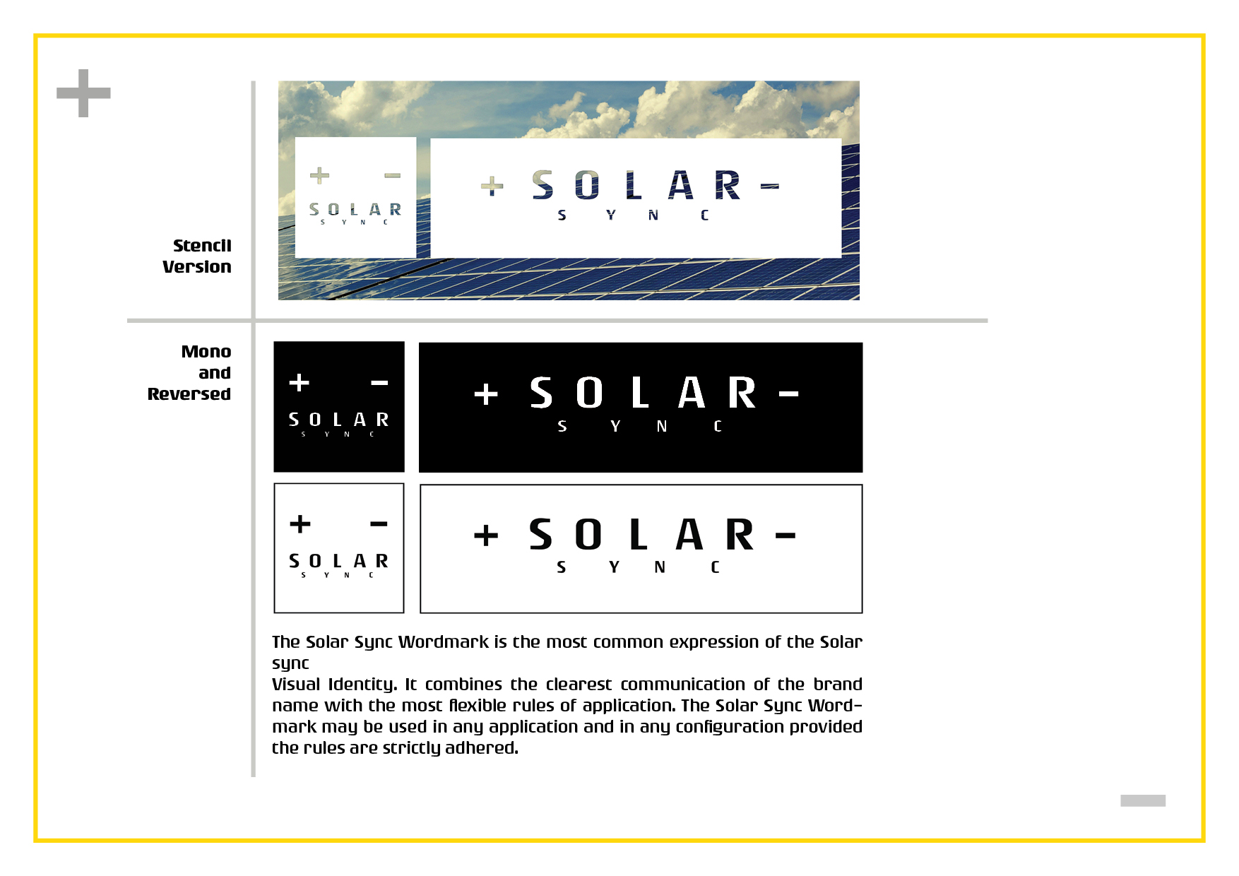
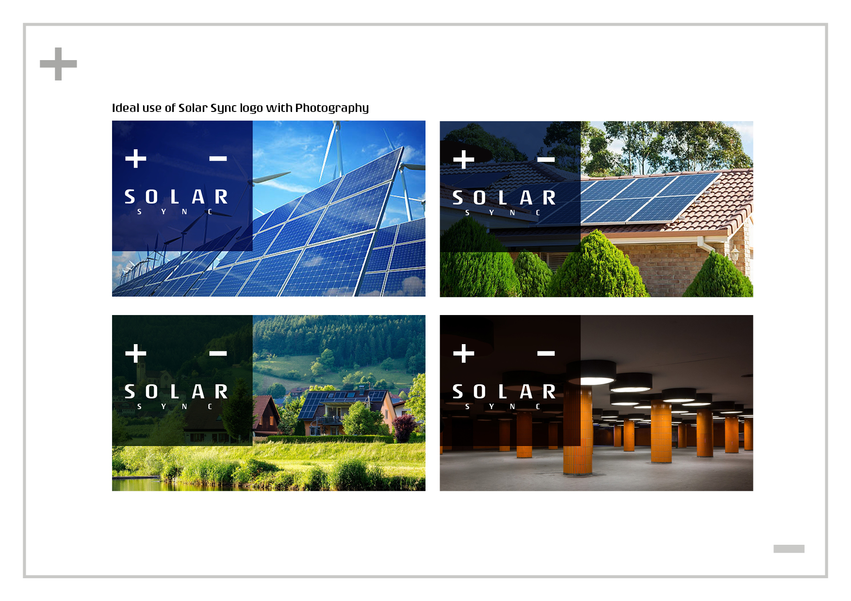
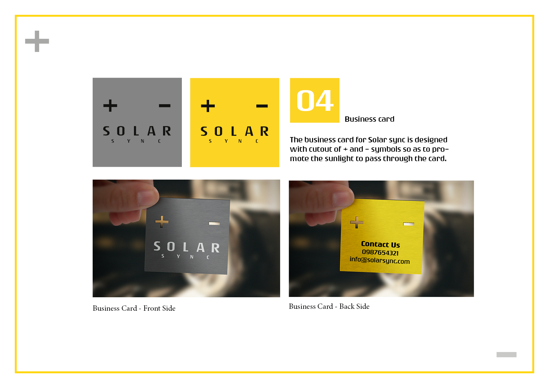
To further refine my vision, I created a mood board that incorporated various color themes, shapes, text, and photos. This exercise allowed me to clarify the message I intended to convey. Ultimately, I decided to design a word-based logo for “Solar Sync” that embodied simplicity and effectively represented the company. The logo ingeniously incorporates the symbols of “+” and “-” to symbolize an electric battery.
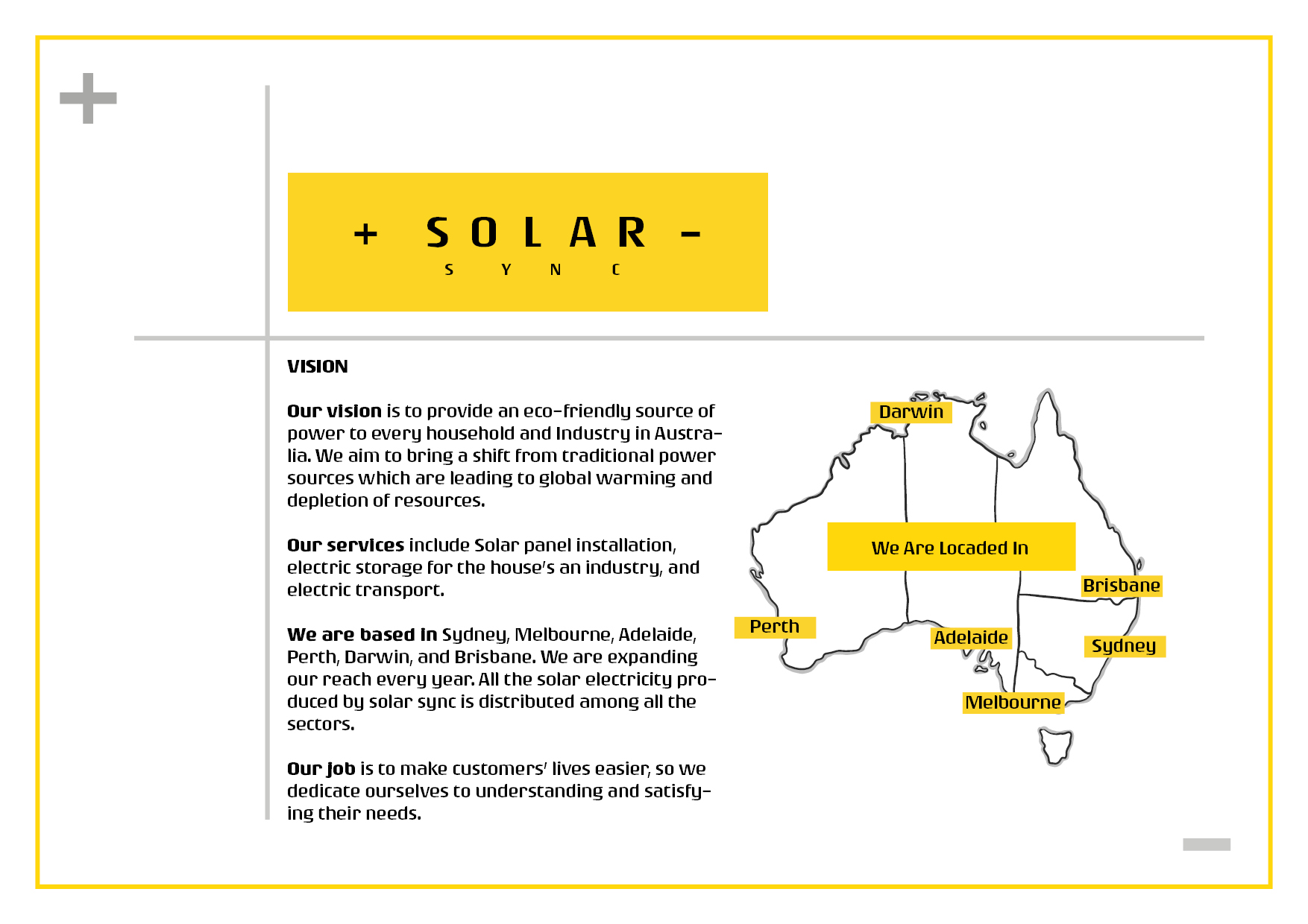
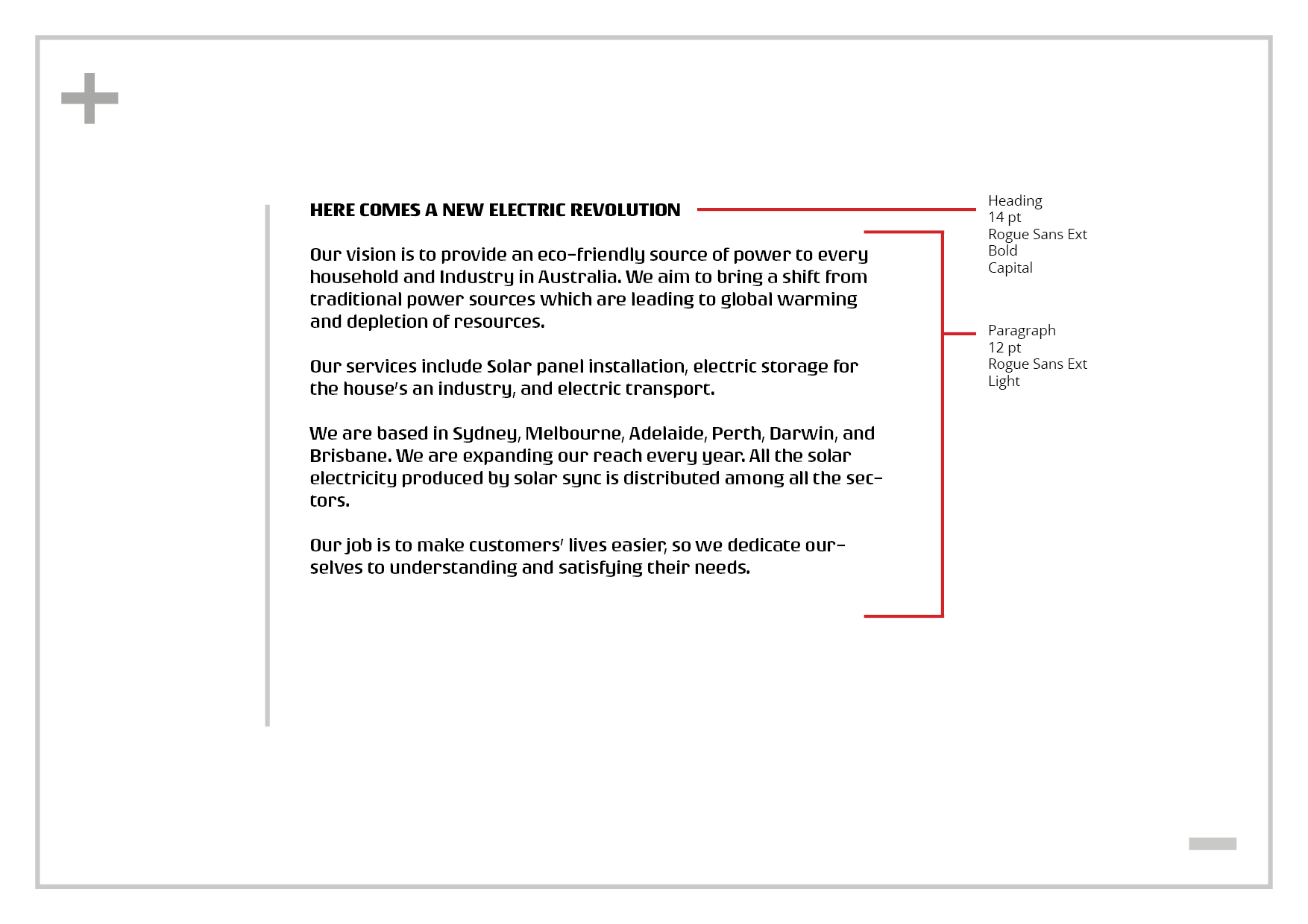
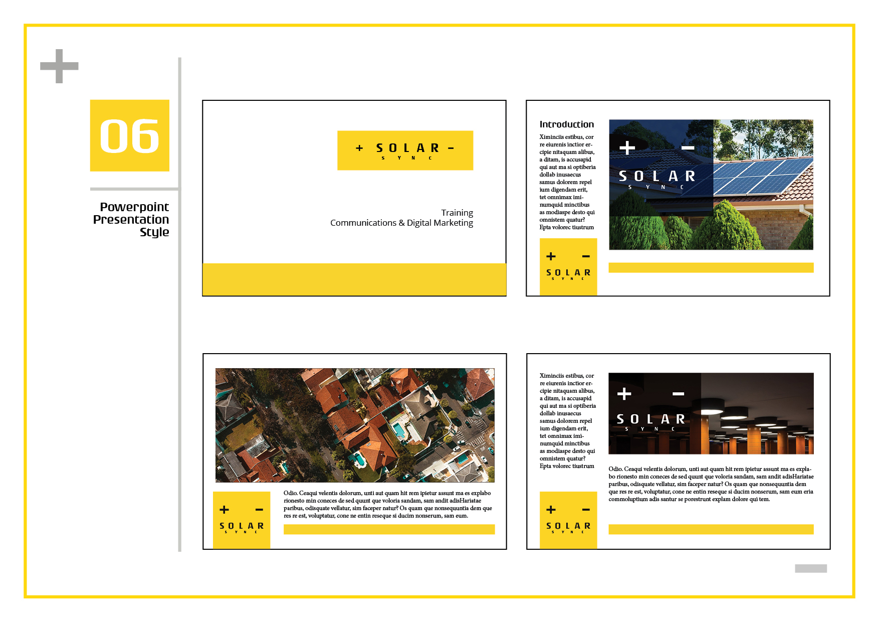
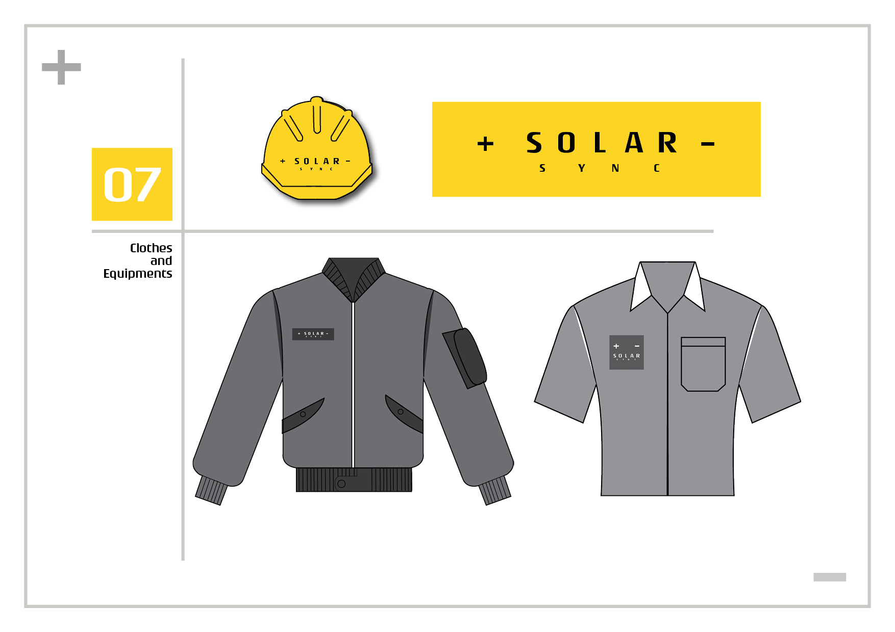
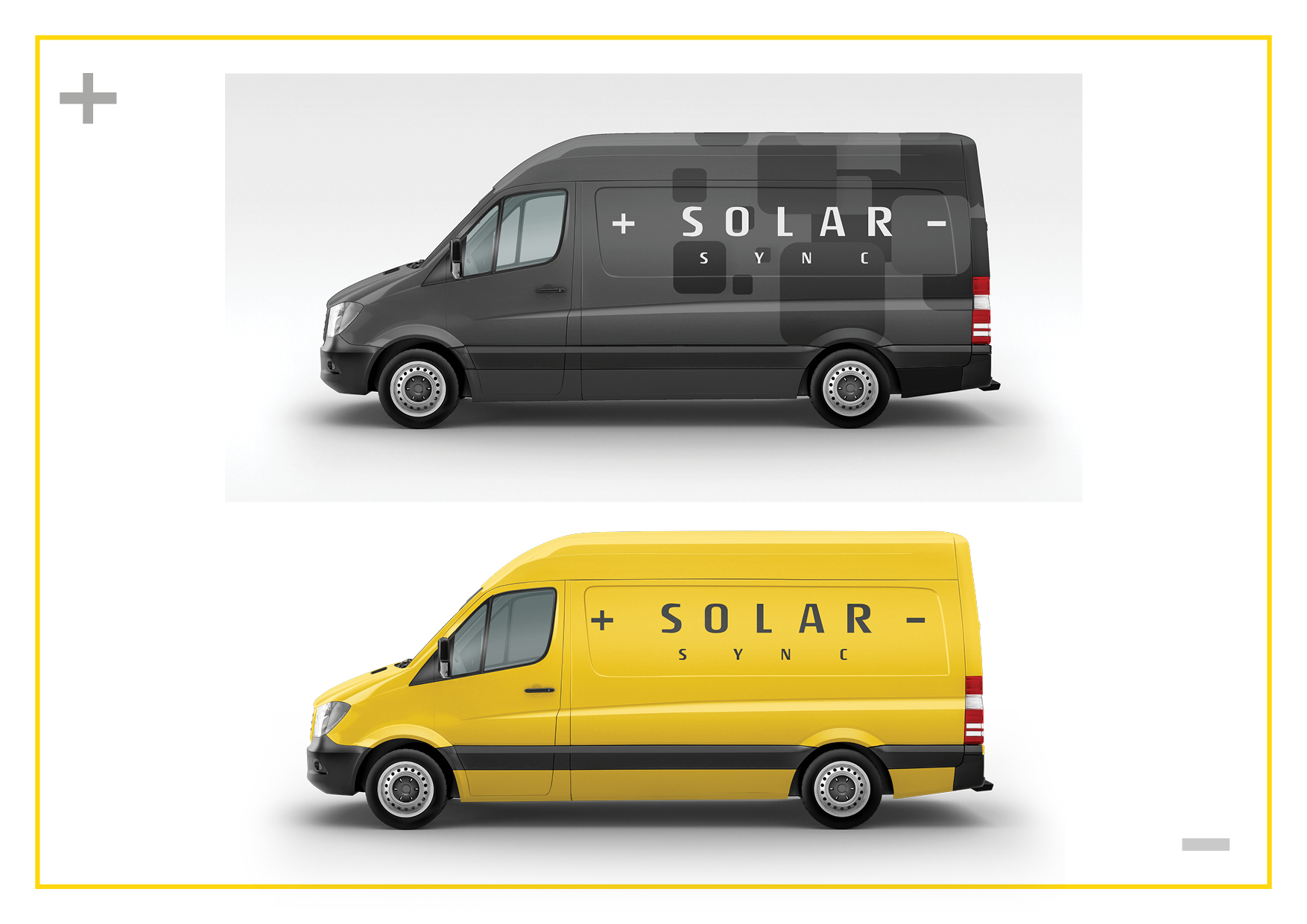
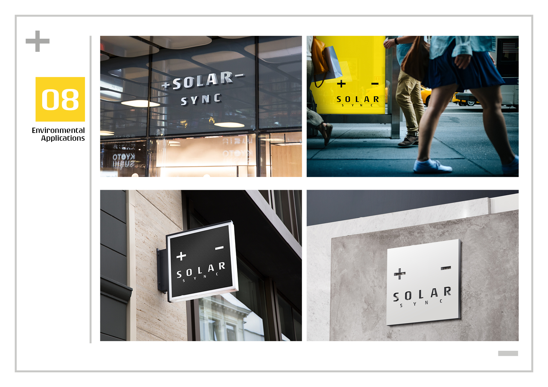
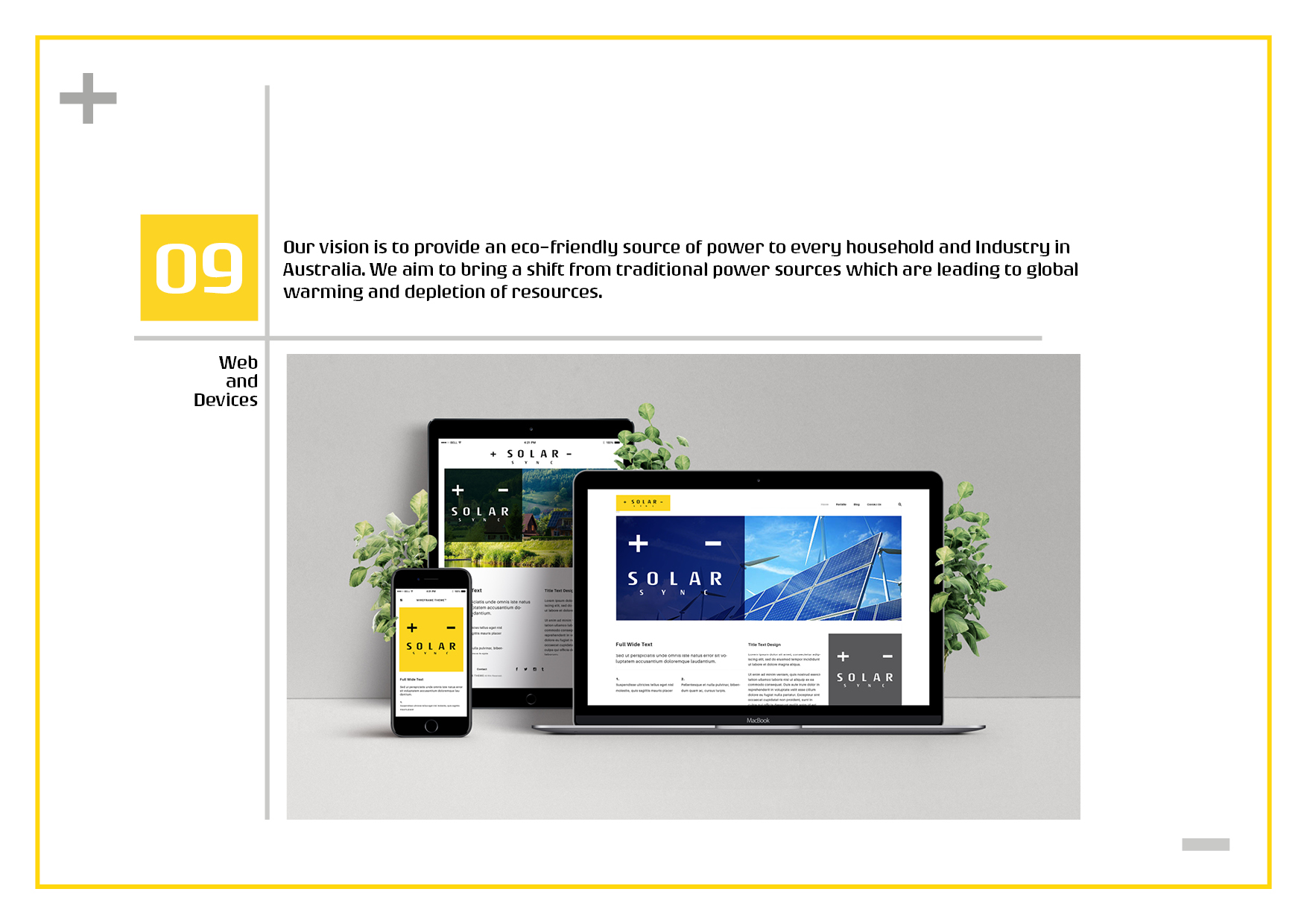
The company’s core objective is to provide electricity to the public through solar plants located across different regions in Australia. With its presence spanning multiple locations throughout the country, Solar Sync aims to distribute clean energy. The final application of this project encompassed business cards, uniforms, environmental design, as well as various web and print materials.

